Minaal Carry-on 2.0 color comparison
Sun Dec 24, 2017 · 2 min read
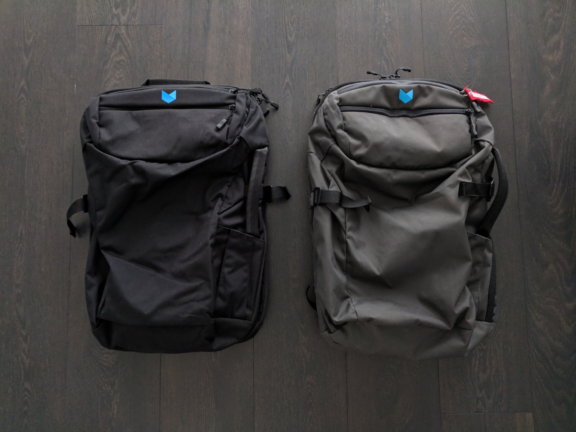
If you’ve read my original Minaal Carry-on 2.0 review, you’ll know that the grey color wasn’t my favorite, as much as I liked the rest of the bag. I was recently gifted the same bag in the new Aoraki black, so here are some photos directly comparing the two colors. I took these photos by diffuse daylight with a Google Pixel XL, and haven’t doctored the colors in any way.

Especially in indoor lighting, I thought the grey color took on a rather army-green tinge. Side-by-side in daylight, there isn’t much green. I’ve had the grey bag only a few months, and it’s held up very well and never been washed, so the color remains the same as when it was brand new. In my opinion, next to the black bag, it seems a little washed out.
If the black color holds up as well as the grey has, I’ll be pretty happy with it. I think it looks sleek and smart, and would fit in anywhere from city trains to forest treks.
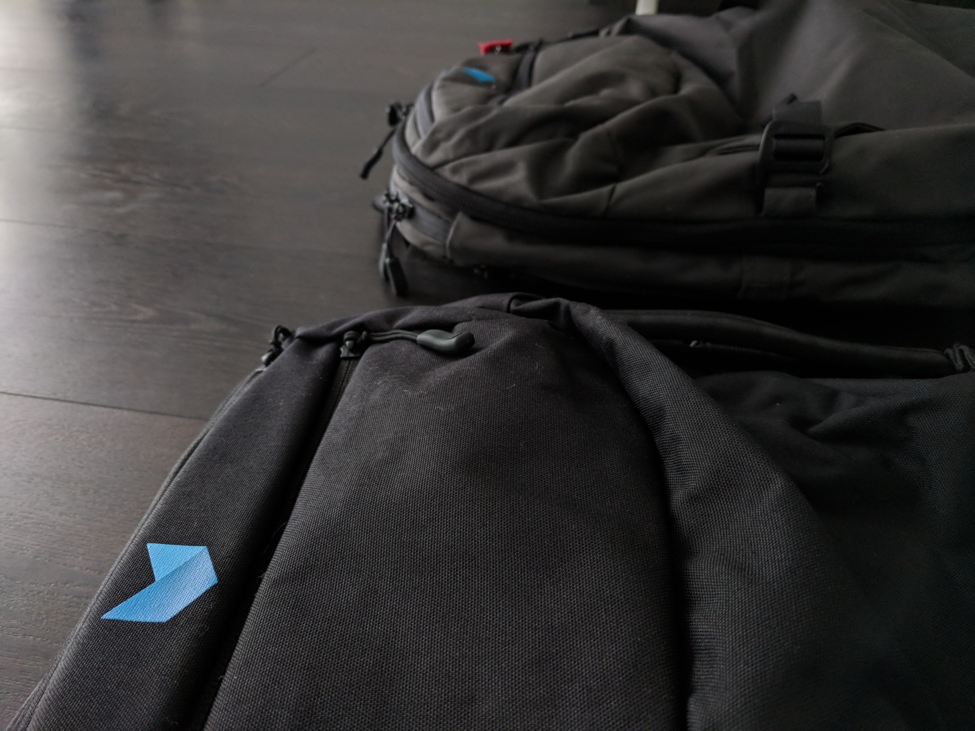
That said, this beautiful black fabric has its downsides. The fabric is identical between the two bags, and its rough texture picks up dust and dirt pretty easily. It’s not a big deal unless you’re hoping to carry your pack off a plane and into a meeting. While the grey color is light enough not to show it, there’s no hiding white fuzzies against Aoraki black.
One more thing to note is that on the grey bag, a color-coded black zipper for the main compartment was touted as a feature that helped you tell the zippers apart. You can see it in the above photo. Personally, this never worked for me, and I solved the issue by putting a keychain on the main compartment’s zipper. The new black color forgoes the whole color-coding scheme altogether - every zipper is black.
Overall, the color is a small thing when considering how great the bag itself is. That said… I still like the black color better!